UI Toolkit Project Setup: Structure and Team Workflows
Three months into your UI Toolkit project, finding the right USS file takes five minutes. Merge conflicts break your layouts. The designer can’t find where to edit button styles. Your teammate just created a fourth ‘global.uss’ file. Welcome to UI Toolkit chaos.
UI Toolkit projects grow complex fast. Without proper organization from day one, technical debt accumulates. Team collaboration breaks down. What started as a promising modern UI system becomes a maintenance nightmare.
The cost of poor setup follows a predictable pattern:
Week 1: “This is fine, we’ll organize later”
Month 1: “Which USS file has the button styles again?”
Month 3: “We need to refactor the entire UI structure”
Month 6: “Let’s just rebuild from scratch”
This guide shows you production-tested UI Toolkit project organization. Folder structures that scale. USS architecture that makes sense. Version control that works. Team workflows that prevent conflicts. Set up once, develop efficiently forever.
You will build a complete UI Toolkit project structure you can clone and use immediately, or adapt these patterns to your existing projects before technical debt accumulates.
What You’ll Learn
This guide covers a professional UI Toolkit organization from foundation to deployment:
- Why project organization matters for UI Toolkit specifically
- Recommended folder structure for Assets/UI hierarchy
- UXML organization patterns (scene UI vs editor UI vs templates)
- USS file architecture (global, components, themes)
- C# script organization (controllers, custom elements, utilities)
- Asset naming conventions for discoverability
- Version control best practices (.gitignore, LFS, merge strategies)
- Team collaboration workflows (designer-developer handoff)
- Asset pipeline integration (addressables, bundles, build process)
- Testing and validation strategies
- Common pitfalls and how to avoid them
Prerequisites
Required:
- Unity 2022.3 LTS or Unity 6
- Basic UI Toolkit knowledge (understanding of VisualElements, UXML, and USS)
- Understanding of Unity’s Assets folder structure
Helpful:
- Experience with CSS/web development (for USS concepts)
- Team development experience (for collaboration sections)
- Version control knowledge (Git)
What This Post Is: Organizational patterns and structures for UI Toolkit projects.
What This Post Is Not: How to write USS (covered in Post #5) or create VisualElements (Post #3)—those come later in the series.
Why UI Toolkit Organization Matters
UI Toolkit introduces new file types to Unity projects that require careful organization:
- UXML files: UI layouts and hierarchies
- USS files: Stylesheets (like CSS)
- C# custom controls: Extended VisualElement classes
- Asset references: Sprites, fonts, icons used in UI
Without clear organization, projects quickly descend into chaos.
USS Chaos Scenario
Assets/
├── GlobalStyles.uss
├── global.uss
├── Global_styles_new.uss
├── ButtonStyles.uss
├── ButtonStyle.uss
└── button-final.uss

// Which one is actually used?
// Which has the latest button styles?
// Who created three versions?
UXML Sprawl Scenario
Assets/
├── MainMenu.uxml
├── MainMenuNew.uxml
├── Settings.uxml
├── SettingsPanel.uxml
├── PlayerHUD.uxml
└── Scripts/
    └── HUD.uxml  // Why is UXML in Scripts?
Lost Assets Scenario
The designer asks: “Where do I put new button icons?”
Four answers exist:
Assets/Sprites/UI/...Assets/UI/Icons/...Assets/Textures/Interface/...Assets/Images/Buttons/...
All four exist. No one knows which is canonical.
Impact on Development
Solo Developer:
- Time wasted searching for files
- Duplicate work (didn’t know asset already existed)
- Refactoring fear (might break unknown dependencies)
Team Development:
- Merge conflicts on monolithic USS files
- Designer-developer communication breakdown
- Conflicting naming conventions
- “Works on my machine” bugs from wrong file references
Technical Debt Accumulation:
- Month 1: Small inefficiencies
- Month 3: Noticeable slowdown
- Month 6: Major refactor needed
- Month 12: Consider rebuilding UI system
The fix? Establish structure at project start. This post provides that structure.
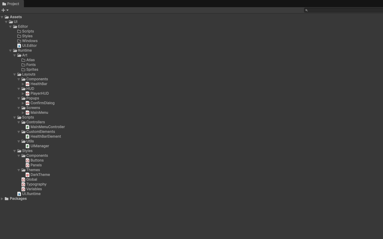
Recommended Folder Structure
Here’s a production-tested UI Toolkit hierarchy that scales from small prototypes to large commercial projects:
Assets/
└── UI/
    ├── Runtime/                    # Game UI (runs in builds)
    │   ├── Layouts/               # UXML files
    │   │   ├── Screens/          # Full-screen UIs
    │   │   │   ├── MainMenu.uxml
    │   │   │   ├── Settings.uxml
    │   │   │   └── PauseMenu.uxml
    │   │   ├── HUD/              # Heads-up displays
    │   │   │   ├── PlayerHUD.uxml
    │   │   │   └── MinimapHUD.uxml
    │   │   ├── Popups/           # Modals and dialogs
    │   │   │   ├── ConfirmDialog.uxml
    │   │   │   └── RewardPopup.uxml
    │   │   └── Components/        # Reusable UI pieces
    │   │       ├── HealthBar.uxml
    │   │       ├── SkillButton.uxml
    │   │       └── InventorySlot.uxml
    │   │
    │   ├── Styles/                # USS files
    │   │   ├── Global.uss        # Reset, base styles
    │   │   ├── Variables.uss     # Design tokens (colors, sizes)
    │   │   ├── Typography.uss    # Text styles
    │   │   ├── Components/       # Component-specific styles
    │   │   │   ├── Buttons.uss
    │   │   │   ├── Panels.uss
    │   │   │   └── Forms.uss
    │   │   └── Themes/           # Theme variants
    │   │       ├── DarkTheme.uss
    │   │       └── LightTheme.uss
    │   │
    │   ├── Scripts/               # Runtime C# code
    │   │   ├── Controllers/      # UI controllers
    │   │   │   ├── MainMenuController.cs
    │   │   │   └── HUDController.cs
    │   │   ├── CustomElements/   # Custom VisualElements
    │   │   │   ├── HealthBarElement.cs
    │   │   │   └── SkillTreeElement.cs
    │   │   └── Utilities/        # Helpers
    │   │       ├── UIManager.cs
    │   │       └── UIAnimations.cs
    │   │
    │   └── Art/                     # UI-specific assets
    │       ├── Sprites/          # UI sprites and icons
    │       ├── Fonts/            # UI fonts
    │       └── Atlas/            # Sprite atlases
    │
    └── Editor/                    # Editor-only UI (not in builds)
        ├── Windows/              # Custom editor windows
        │   └── UIDesignTool.uxml
        ├── Inspectors/           # Custom inspectors
        │   └── CustomPropertyDrawer.uxml
        ├── Styles/               # Editor USS files
        │   └── EditorStyles.uss
        └── Scripts/              # Editor C# code
            └── UIDesignToolWindow.cs
Key Organizational Principles
Runtime vs Editor Separation
Clear distinction between game UI and editor tools prevents editor code from shipping in builds. Runtime uses game terminology, Editor uses Unity terminology.
File Type Segregation
UXML lives in Layouts/, USS in Styles/, C# in Scripts/, and assets in Assets/. This makes finding file types easy and simplifies build pipeline configuration.
Hierarchical Specificity
General files come first, specific files nested deeper. Global.uss establishes base styles, Components/Buttons.uss adds button-specific styles. Screens are full UIs, Components are reusable pieces.
Flat Where Possible, Nested Where Necessary
Layouts/Screens stays flat for easy browsing. Styles/Components uses organization because you’ll have many components. Balance between organization and over-nesting.
Adapting for Your Project
Mobile Game:
Assets/UI/Runtime/Layouts/
├── Home/            # Home screen and submenus
├── Gameplay/        # In-game UI
├── Shop/            # Monetization UI
└── Social/          # Friends, chat, etc.
Desktop Application:
Assets/UI/Runtime/Layouts/
├── MainWindow/      # Primary application window
├── Dialogs/         # Modal dialogs
├── Toolbars/        # App toolbars
└── Sidebars/        # Side panels
VR/AR Application:
Assets/UI/Runtime/Layouts/
├── WorldSpace/      # 3D UI in world
├── Overlay/         # 2D screen overlays
└── Diegetic/        # UI integrated into 3D objects
Small Project (less than 10 UI screens):
Assets/UI/
├── Layouts/         # All UXML files (no subfolders)
├── Styles/          # All USS files (no subfolders)
├── Scripts/         # All C# files (no subfolders)
└── Assets/          # All UI assets
Large Project (100+ UI screens):
Add feature-based organization:
Assets/UI/Runtime/
├── Core/            # Shared across features
├── Features/
│   ├── Combat/      # Combat-specific UI
│   ├── Inventory/   # Inventory-specific UI
│   └── Crafting/    # Crafting-specific UI
└── Shared/          # Reusable components
USS File Architecture
The USS import strategy determines how maintainable your stylesheets remain as projects scale.
Variables.uss (Design Tokens)
/* Variables.uss - Design system foundation */
:root {
    /* Colors */
    --color-primary: #2563EB;
    --color-primary-hover: #1D4ED8;
    --color-secondary: #10B981;
    --color-danger: #EF4444;
    --color-text: #1F2937;
    --color-text-secondary: #6B7280;
    --color-background: #FFFFFF;
    --color-surface: #F3F4F6;

    /* Spacing */
    --spacing-xs: 4px;
    --spacing-sm: 8px;
    --spacing-md: 16px;
    --spacing-lg: 24px;
    --spacing-xl: 32px;

    /* Typography */
    --font-size-xs: 12px;
    --font-size-sm: 14px;
    --font-size-base: 16px;
    --font-size-lg: 18px;
    --font-size-xl: 24px;
    --font-size-2xl: 32px;

    /* Border Radius */
    --radius-sm: 4px;
    --radius-md: 8px;
    --radius-lg: 12px;
    --radius-full: 9999px;

    /* Transitions */
    --transition-fast: 150ms;
    --transition-base: 300ms;
    --transition-slow: 500ms;
}
Global.uss (Base Styles)
/* Global.uss - Reset and base styles */
@import url("Variables.uss");

/* Reset */
* {
    margin: 0;
    padding: 0;
}

/* Base typography */
.unity-label {
    color: var(--color-text);
    font-size: var(--font-size-base);
}

/* Base layout */
.screen {
    width: 100%;
    height: 100%;
    background-color: var(--color-background);
}

.panel {
    background-color: var(--color-surface);
    border-radius: var(--radius-md);
    padding: var(--spacing-md);
}
Components/Buttons.uss (Component Styles)
/* Buttons.uss - All button variations */
@import url("../Global.uss");

.button {
    background-color: var(--color-primary);
    color: white;
    border-radius: var(--radius-md);
    padding: var(--spacing-sm) var(--spacing-md);
    transition-duration: var(--transition-fast);
}

.button:hover {
    background-color: var(--color-primary-hover);
}

.button--secondary {
    background-color: var(--color-secondary);
}

.button--danger {
    background-color: var(--color-danger);
}

.button--large {
    padding: var(--spacing-md) var(--spacing-lg);
    font-size: var(--font-size-lg);
}
Import Strategy: Main.uss
/* Main.uss - Import all styles in correct order */

/* 1. Variables first (no dependencies) */
@import url("Variables.uss");

/* 2. Global styles (depends on Variables) */
@import url("Global.uss");
@import url("Typography.uss");

/* 3. Component styles (depends on Global) */
@import url("Components/Buttons.uss");
@import url("Components/Panels.uss");
@import url("Components/Forms.uss");

/* 4. Theme overrides last (depends on everything) */
@import url("Themes/DarkTheme.uss");
Note on @import Support: While USS files support the
@importrule according to Unity documentation, this feature works most reliably in Theme Style Sheet (TSS) files. For runtime UI, consider these alternatives:
- UXML: Add
<Style src="path/to/styles.uss"/>directly in your UXML files- C#: Use
rootVisualElement.styleSheets.Add(Resources.Load<StyleSheet>("styles"))The @import approach shown above works well for editor tooling and TSS-based theming systems.
USS File Naming Conventions
Use PascalCase for files:
Variables.ussnotvariables.ussButtons.ussnotbuttons.uss- Consistency with Unity’s C# naming
Use kebab-case for CSS classes:
.button--primarynot.buttonPrimary.health-barnot.healthBar- Standard CSS convention
Prefix custom classes:
/* Component-specific classes */
.hud-health-bar { }
.menu-button { }
.inventory-slot { }

/* Avoids conflicts with Unity built-in classes */
One Responsibility Per File:
Buttons.ussonly has button stylesForms.ussonly has form element stylesMainMenu.ussonly has MainMenu-specific styles- Easier to find, easier to maintain
C# Script Organization
Proper script architecture separates concerns and promotes code reuse.
Controllers (UI Logic)
// MainMenuController.cs
// Location: Assets/UI/Runtime/Scripts/Controllers/

using UnityEngine;
using UnityEngine.UIElements;

namespace Game.UI.Runtime
{
    public class MainMenuController : MonoBehaviour
    {
        [SerializeField] private UIDocument uiDocument;

        private Button playButton;
        private Button settingsButton;
        private Button quitButton;

        private void OnEnable()
        {
            var root = uiDocument.rootVisualElement;

            playButton = root.Q<Button>("play-button");
            settingsButton = root.Q<Button>("settings-button");
            quitButton = root.Q<Button>("quit-button");

            playButton.clicked += OnPlayClicked;
            settingsButton.clicked += OnSettingsClicked;
            quitButton.clicked += OnQuitClicked;
        }

        private void OnDisable()
        {
            playButton.clicked -= OnPlayClicked;
            settingsButton.clicked -= OnSettingsClicked;
            quitButton.clicked -= OnQuitClicked;
        }

        private void OnPlayClicked() { /* Game logic here */ }
        private void OnSettingsClicked() { /* Settings logic */ }
        private void OnQuitClicked() { /* Quit logic */ }
    }
}
Custom Elements (Reusable Components)
// HealthBarElement.cs
// Location: Assets/UI/Runtime/Scripts/CustomElements/

using UnityEngine;
using UnityEngine.UIElements;

namespace Game.UI.Runtime.Elements
{
    [UxmlElement]
    public partial class HealthBarElement : VisualElement
    {
        [UxmlAttribute("max-health")]
        public float MaxHealth { get; set; } = 100f;

        public float CurrentHealth { get; private set; }

        private VisualElement fillBar;
        private Label healthText;

        public HealthBarElement()
        {
            AddToClassList("health-bar");

            fillBar = new VisualElement();
            fillBar.AddToClassList("health-bar__fill");

            healthText = new Label();
            healthText.AddToClassList("health-bar__text");

            Add(fillBar);
            Add(healthText);

            SetHealth(MaxHealth);
        }

        public void SetHealth(float health)
        {
            CurrentHealth = Mathf.Clamp(health, 0, MaxHealth);
            float fillPercentage = CurrentHealth / MaxHealth;

            fillBar.style.width = Length.Percent(fillPercentage * 100);
            healthText.text = $"{CurrentHealth:F0} / {MaxHealth:F0}";
        }
    }
}
Utilities (Helper Classes)
// UIManager.cs
// Location: Assets/UI/Runtime/Scripts/Utilities/

using UnityEngine;
using UnityEngine.UIElements;

namespace Game.UI.Runtime.Utilities
{
    public class UIManager : MonoBehaviour
    {
        private static UIManager instance;
        public static UIManager Instance => instance;

        private void Awake()
        {
            if (instance != null && instance != this)
            {
                Destroy(gameObject);
                return;
            }

            instance = this;
            DontDestroyOnLoad(gameObject);
        }

        public void ShowScreen(string screenName)
        {
            // Screen management logic
        }

        public void HideAllScreens()
        {
            // Hide logic
        }
    }
}
Naming Conventions
Controllers:
{ScreenName}Controller.cs(e.g.,MainMenuController.cs)- MonoBehaviour classes
- Handle UI events and game logic interaction
Custom Elements:
{ElementName}Element.cs(e.g.,HealthBarElement.cs)- Inherit from VisualElement
- Reusable UI components
Utilities:
- Descriptive names (e.g.,
UIManager.cs,UIAnimations.cs) - Static classes or singletons
- Shared functionality
Asset Naming Conventions
Consistent naming prevents chaos and improves discoverability.
UXML Files
PascalCase with context:
- MainMenu.uxml
- PlayerHUD.uxml
- SettingsPanel.uxml
- HealthBarComponent.uxml

- mainmenu.uxml (not PascalCase)
- hud.uxml (not descriptive enough)
- panel1.uxml (meaningless name)
USS Files
PascalCase, descriptive:
- Global.uss
- Variables.uss
- Buttons.uss
- DarkTheme.uss

- style.uss (too generic)
- new-buttons.uss (kebab-case for files)
- buttons_v2.uss (no version suffixes)
C# Scripts
PascalCase, follows C# conventions:
- MainMenuController.cs
- HealthBarElement.cs
- UIManager.cs

- main_menu_controller.cs (not PascalCase)
- Controller.cs (too generic)
- UI.cs (conflicts with Unity namespace)
UI Assets (Sprites)
kebab-case with descriptive names:
- health-potion.png
- button-background.png
- weapon-sword.png
- panel-border.png

All UI sprites go in Art/Sprites/ folder.
Use subfolders for large projects:
Sprites/
  - Buttons/
  - Panels/
  - Items/
Prefixing Strategy
When working in large multi-system projects:
UI/
├── ui_MainMenu.uxml           (prefix distinguishes from non-UI assets)
├── ui_PlayerHUD.uxml
└── Styles/
    ├── ui_Global.uss
    └── ui_Buttons.uss
When UI is in dedicated UI/ folder:
UI/
├── MainMenu.uxml              (no prefix needed, context clear)
├── PlayerHUD.uxml
└── Styles/
    ├── Global.uss
    └── Buttons.uss
Version Control Naming
- MainMenu_v2.uxml
- Buttons_final.uss
- Buttons_final_REALLY.uss

- Use Git for versioning, not filenames
- Commit often with good messages
- Use branches for experiments
Version Control Best Practices
Proper version control prevents merge conflicts and protects UI assets.
.gitignore for UI Toolkit
# Unity generated
[Ll]ibrary/
[Tt]emp/
[Oo]bj/
[Bb]uild/
[Bb]uilds/
[Ll]ogs/
[Uu]ser[Ss]ettings/

# UI Toolkit generated files
*.meta.bak

# IDE files
.vscode/
.idea/
*.sln
*.csproj

# OS files
.DS_Store
Thumbs.db
What to Commit
Always commit:
.uxmlfiles.ussfiles.csscripts.metafiles (critical for Unity)- UI assets (icons, sprites)
Never commit:
Library/folder (Unity generated).cachefiles- Personal editor settings
Git LFS for Large Assets
# .gitattributes
*.png filter=lfs diff=lfs merge=lfs -text
*.jpg filter=lfs diff=lfs merge=lfs -text
*.psd filter=lfs diff=lfs merge=lfs -text
*.ttf filter=lfs diff=lfs merge=lfs -text
*.otf filter=lfs diff=lfs merge=lfs -text
Merge Conflict Prevention
Problem: USS merge conflicts
/* Buttons.uss - Monolithic file */
<<<<<<< HEAD
.button { background-color: blue; }
.button:hover { background-color: darkblue; }
/* 500 more lines... */
=======
.button { background-color: red; }
.button:hover { background-color: darkred; }
/* 500 more lines... */
>>>>>>> feature-branch
Solution: Split files
Styles/Components/
├── Buttons-Primary.uss     # Developer A works here
├── Buttons-Secondary.uss   # Developer B works here
└── Buttons-Common.uss      # Shared, edit carefully
Commit Message Conventions
# Good UI Toolkit commit messages
git commit -m "Add dark theme USS files"
git commit -m "Fix button hover state in MainMenu.uxml"
git commit -m "Refactor HealthBar to use custom VisualElement"
git commit -m "Update UI folder structure for better organization"

# Bad commit messages
git commit -m "UI changes"
git commit -m "Fixed stuff"
git commit -m "WIP"
Branch Strategy
main              # Production-ready UI
├─ develop       # Integration branch
   ├─ feature/main-menu-redesign
   ├─ feature/hud-improvements
   └─ fix/button-styling-bug
Team Collaboration Workflows
Designer-developer collaboration requires clear processes and shared understanding.
Step 1: Design System Agreement
Create shared UIStyleGuide.md:
# UI Style Guide

## Colors
- Primary: #2563EB (blue)
- Secondary: #10B981 (green)
- Danger: #EF4444 (red)

## Typography
- Heading: 24px, bold
- Body: 16px, regular
- Small: 12px, regular

## Spacing
- Base unit: 8px
- Use multiples: 8px, 16px, 24px, 32px

## Components
- Buttons: 40px height, 16px padding
- Panels: 8px border radius, #F3F4F6 background
Step 2: UXML Creation (Designer)
Designer creates UXML in UI Builder:
- Designer builds layout visually
- Saves UXML file with agreed naming
- Commits to feature branch
- Notifies developer
Step 3: USS Styling (Designer or Developer)
/* Designer-friendly approach: */
.button-primary {
    background-color: #2563EB;
}

/* Developer-friendly approach: */
.button {
    background-color: var(--color-primary);
}
Step 4: Controller Integration (Developer)
// Developer adds logic
public class MainMenuController : MonoBehaviour
{
    [SerializeField] private UIDocument uiDocument;

    private void OnEnable()
    {
        var root = uiDocument.rootVisualElement;

        // Connect to designer's UXML structure
        var playButton = root.Q<Button>("play-button");
        playButton.clicked += OnPlayClicked;
    }

    private void OnPlayClicked()
    {
        // Game logic here
    }
}
Communication Protocol
Daily Workflow:
- Morning: Pull latest changes, check Trello/Jira for UI tasks, check #ui-updates Slack channel
- During Work: Commit small focused changes, push to feature branch frequently, tag teammates in commits if needed
- End of Day: Push all work, update task status, note any blockers
File Ownership
UIStyleGuide.md         → Designer owns, developer reviews
Variables.uss           → Designer owns
UXML files              → Designer creates, developer wires
Controllers/*.cs        → Developer owns
CustomElements/*.cs     → Developer owns, designer reviews
Review Process
- Feature branch created
- Designer + Developer work
- Pull request opened
- Designer reviews visuals
- Developer reviews code
- QA tests functionality
- Merge to develop
Tools:
- Version Control: Git + GitHub/GitLab
- Communication: Slack/Discord
- Task Management: Jira/Trello/Linear
- Design Handoff: Figma → UXML (manual for now)
- Documentation: Markdown in repo
Asset Pipeline Integration
UI assets need proper build pipeline integration for production deployment.
Addressables Setup
// UIAssetManager.cs
using UnityEngine;
using UnityEngine.AddressableAssets;
using UnityEngine.ResourceManagement.AsyncOperations;
using System.Threading.Tasks;

public class UIAssetManager : MonoBehaviour
{
    public async Task<VisualTreeAsset> LoadUILayoutAsync(string layoutName)
    {
        var handle = Addressables.LoadAssetAsync<VisualTreeAsset>($"UI/Layouts/{layoutName}.uxml");
        await handle.Task;

        if (handle.Status == AsyncOperationStatus.Succeeded)
        {
            return handle.Result;
        }

        Debug.LogError($"Failed to load UI layout: {layoutName}");
        return null;
    }

    public async Task<StyleSheet> LoadStyleSheetAsync(string styleName)
    {
        var handle = Addressables.LoadAssetAsync<StyleSheet>($"UI/Styles/{styleName}.uss");
        await handle.Task;

        if (handle.Status == AsyncOperationStatus.Succeeded)
        {
            return handle.Result;
        }

        Debug.LogError($"Failed to load stylesheet: {styleName}");
        return null;
    }
}
Asset Bundle Strategy
UI Bundle Structure:
├── ui-core.bundle        # Shared UI assets (always loaded)
│   ├── Variables.uss
│   ├── Global.uss
│   └── Common icons
├── ui-mainmenu.bundle    # Main menu specific
│   ├── MainMenu.uxml
│   ├── MainMenu.uss
│   └── Menu assets
└── ui-gameplay.bundle    # Gameplay UI
    ├── HUD.uxml
    ├── HUD.uss
    └── HUD assets
Build Process Integration
// Editor script: BuildUIAssets.cs
#if UNITY_EDITOR
using UnityEditor;
using UnityEditor.AddressableAssets.Settings;

public class BuildUIAssets
{
    [MenuItem("Tools/UI/Build UI Asset Bundles")]
    public static void BuildUIBundles()
    {
        // Tag UI assets
        TagUIAssetsForBuild();

        // Build addressables
        AddressableAssetSettings.BuildPlayerContent();

        Debug.Log("UI assets built successfully");
    }

    private static void TagUIAssetsForBuild()
    {
        // Implementation
    }
}
#endif
Performance Considerations
Preload at startup:
- Variables.uss (design tokens)
- Global.uss (base styles)
- Common components
Load on-demand:
- Screen-specific UXML
- Screen-specific USS
- Large UI assets (backgrounds)
Never load:
- Editor-only UI
- Development test UIs
Common Pitfalls
Learn from common mistakes to avoid technical debt.
Pitfall #1: Monolithic USS Files
Problem:
/* AllStyles.uss - 2000 lines, one file */
.button { }
.panel { }
.health-bar { }
/* ... 1900 more lines */
Solution:
Styles/
├── Global.uss (50 lines)
├── Components/
│   ├── Buttons.uss (100 lines)
│   ├── Panels.uss (80 lines)
│   └── HealthBar.uss (60 lines)
Pitfall #2: No Naming Conventions
Problem:
MainMenu.uxml
mainMenu2.uxml
main-menu-new.uxml
MainMenuFinal.uxml
Solution: Use Git branches, not filename versions.
Pitfall #3: Mixing Runtime and Editor
Problem:
Assets/UI/
├── MainMenu.uxml (runtime)
├── EditorWindow.uxml (editor)
└── Settings.uxml (runtime)
Solution:
Assets/UI/
├── Runtime/
│   ├── MainMenu.uxml
│   └── Settings.uxml
└── Editor/
    └── EditorWindow.uxml
Pitfall #4: Poor CSS Specificity
Problem:
.button { color: blue; }
#main-button { color: red; }
.button.primary { color: green; }
/* Which color wins? Confusing! */
Solution: Use consistent specificity, prefer classes over IDs.
Pitfall #5: Not Using Variables
Problem:
/* Repeated values everywhere */
.button { background-color: #2563EB; }
.panel { border-color: #2563EB; }
.icon { color: #2563EB; }

/* Change brand color = find/replace 50 times */
Solution:
:root { --color-primary: #2563EB; }
.button { background-color: var(--color-primary); }
Conclusion
Professional UI Toolkit project organization sets the foundation for maintainable, scalable UI systems.
You’ve learned:
- Scalable folder structures (Runtime/Editor separation)
- USS architecture (Variables → Global → Components → Themes)
- C# script organization (Controllers, CustomElements, Utilities)
- Naming conventions that prevent chaos
- Version control strategies for team collaboration
- Designer-developer workflows that actually work
- Asset pipeline integration for production builds
Starting Your Project
For new projects:
- Create the folder structure outlined in this guide
- Adapt to your specific needs
- Establish naming conventions with team
- Set up version control (.gitignore, LFS)
- Create style guide document
For existing projects:
- Create new organized structure
- Migrate files gradually (by feature)
- Update references in code
- Test thoroughly after each migration
- Delete old structure when complete
Related Posts:
Organization determines whether your UI Toolkit project thrives or becomes technical debt. Start with structure, maintain discipline, and watch your UI system scale.
About Angry Shark Studio
Angry Shark Studio is a professional Unity AR/VR development studio specializing in mobile multiplatform applications and AI solutions. Our team includes Unity Certified Expert Programmers with extensive experience in AR/VR development.
Related Articles
More Articles
Explore more insights on Unity AR/VR development, mobile apps, and emerging technologies.
View All Articles